Opower

As Opower matured, we realized that the existing brand was limiting. A lack of flexible building blocks and expressive palettes really hindered the brand’s ability to express itself. That limiting of expression came in the form of things like salespeople overusing icons because they had nothing else to use, or not having enough colors to properly accent elements throughout the website. We decided it was time to grow the brand.
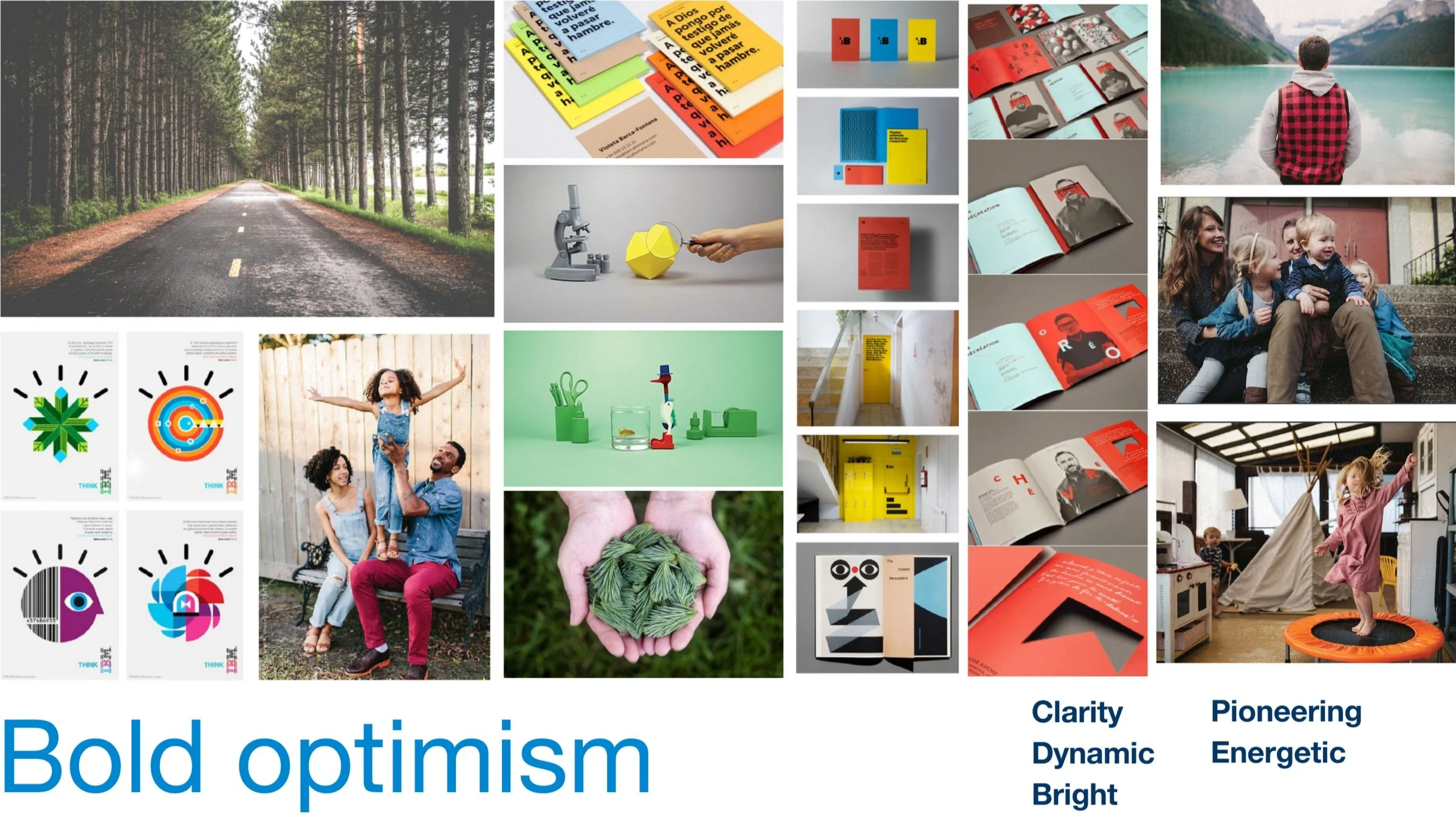
Our Inspiration
We built a brand system to instill bold optimism for a clean energy future.
The process

Listen
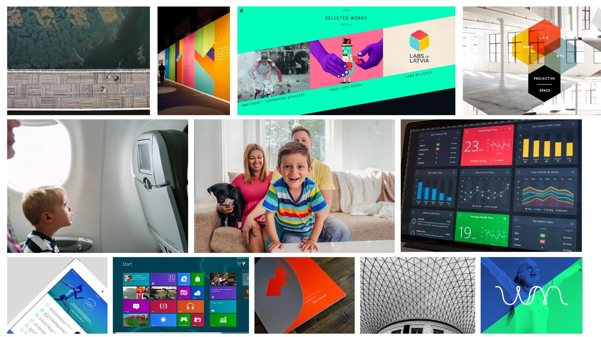
Ideate

Create
Brand Elements + Brand Guide
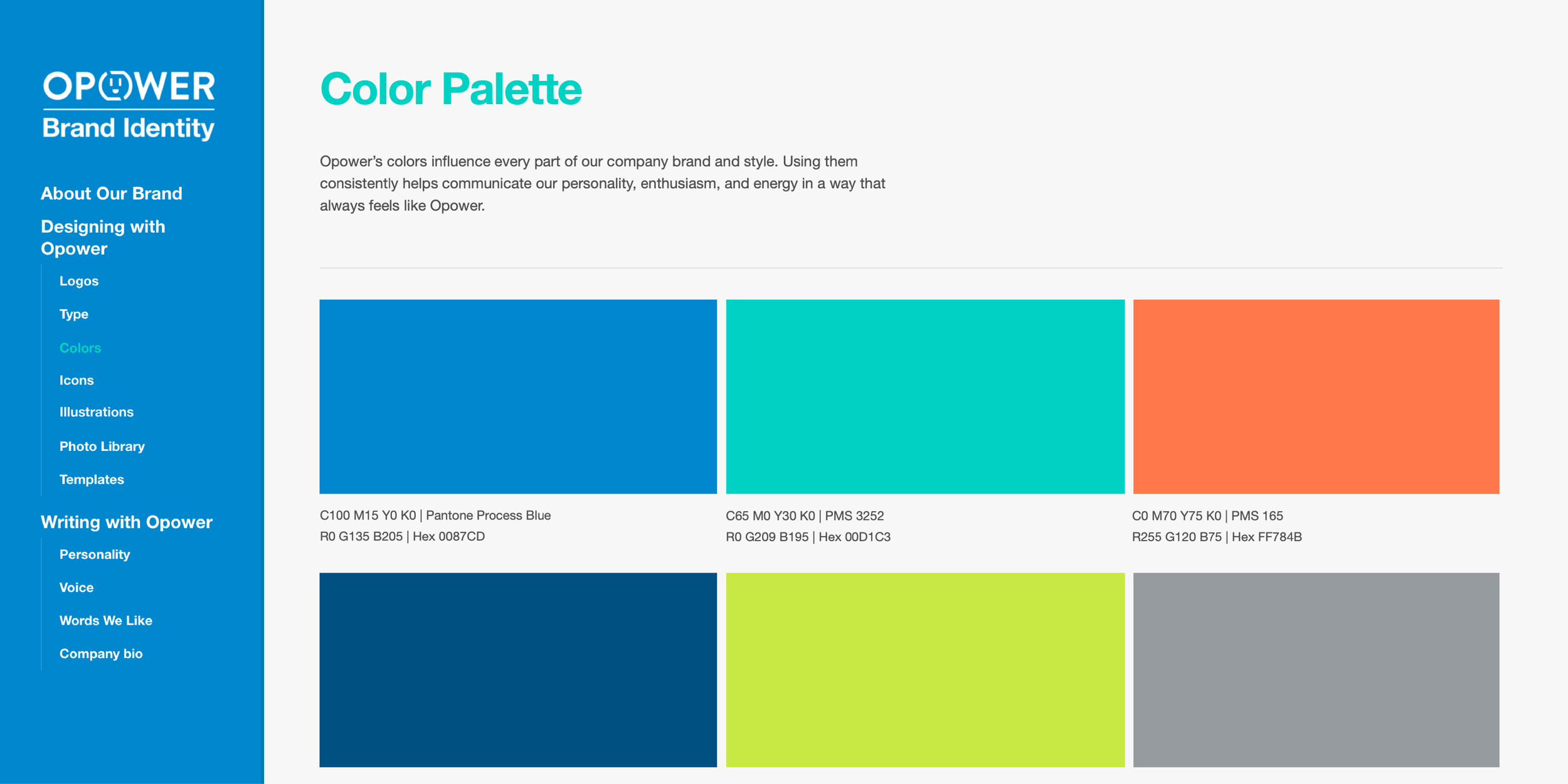
Informed by our thorough research and exploration, we created brand elements that diverted from design norms in the energy & tech industry, but also fully expressed the eccentric nature of the company.


Iconography
The robust library of icons was completely custom created to accommodate for the specificity and uniqueness of Opower’s products, services, and attributes.
Assets
Using the established brand, we worked to propagate it all across the asset suite. Additionally, we worked to take our base brand, and to continue to stretch and experiment beyond the initial redesign efforts.


Events
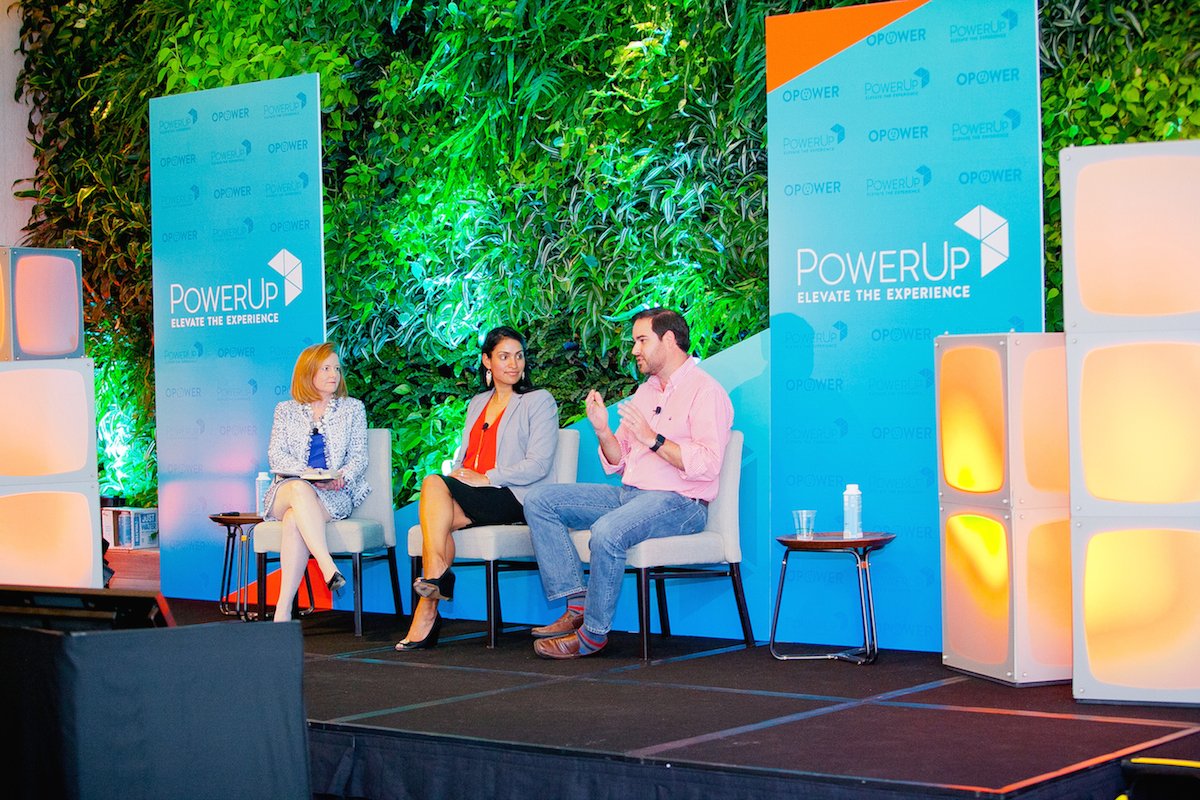
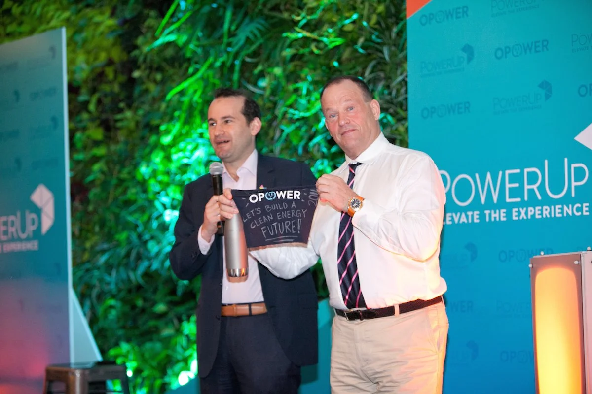
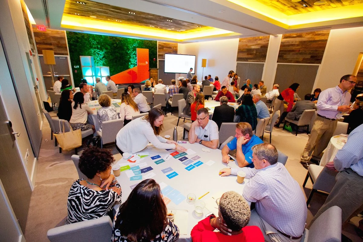
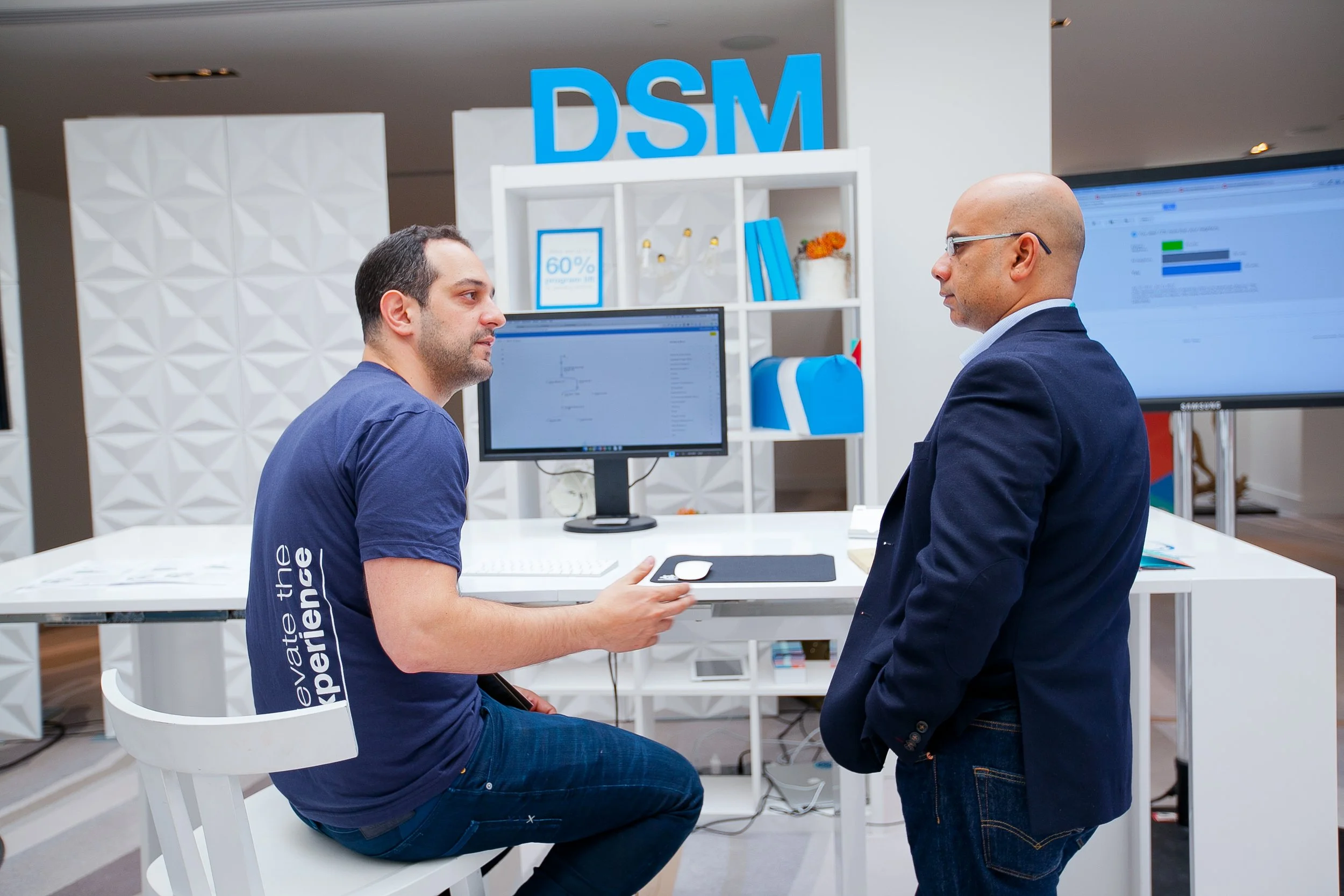
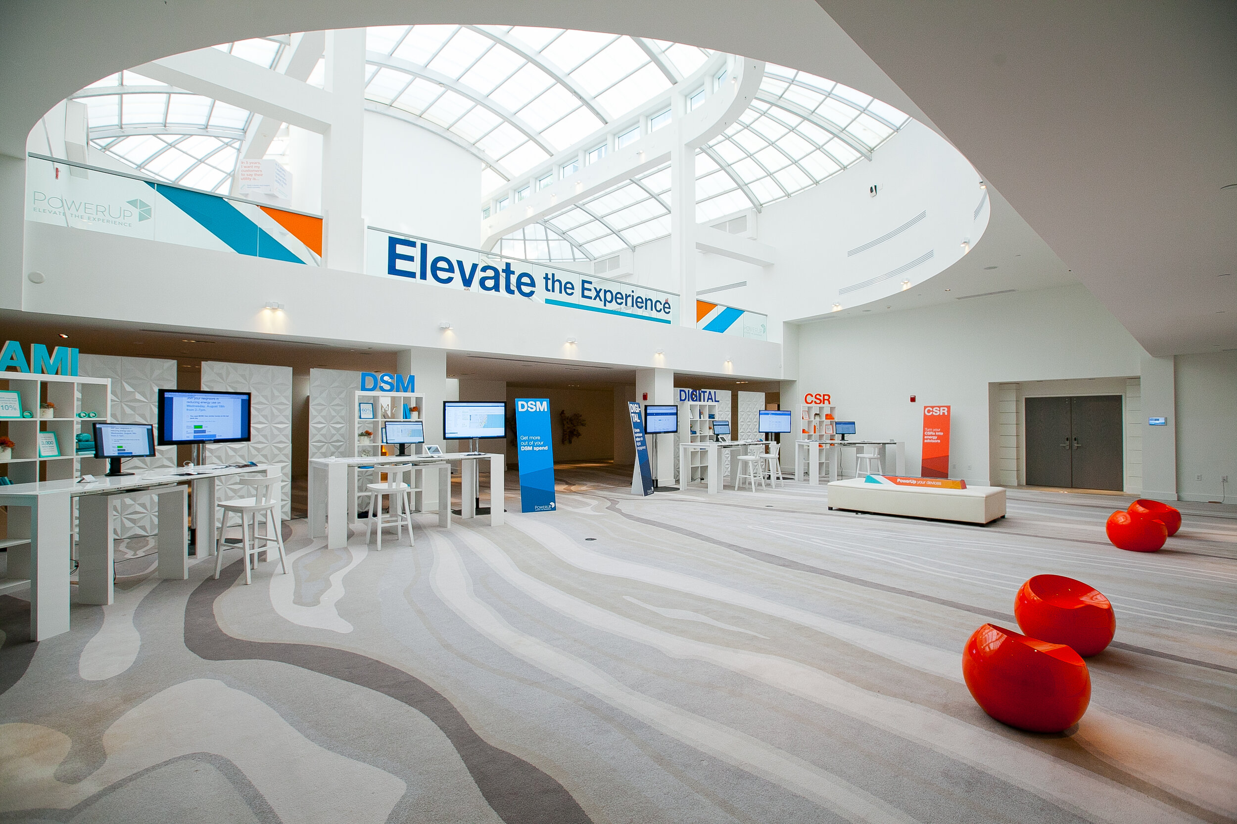
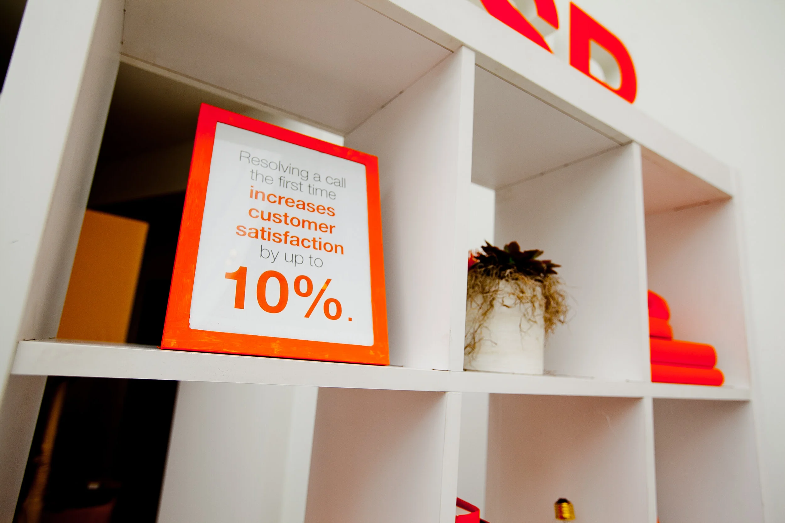
One of the most impactful, and meaningful moments that I had during my time at Opower was around the Powerup Conference. Partnering with the Events & Demand Generation teams, we were able to fully utilize and push the brand forward in a way that accentuated Opower’s credibility and positioned Opower to be an expert and leader in the industry.
